
Course 5 of 6 · The Data Analytics pathway

Python for Data Analytics

pandas, Charts & Business Insights

Analyse real business data with pandas and Plotly in Google Colab. Explore, clean and combine data, chart it clearly and find who comes back and who is worth most, answering requests from the fictional Kettle & Bean team.

View on Udemy ›Get all six in the Bootcamp
  • Course 5 of 6
  • Intermediate
  • Google Colab
  • Self-paced
Python for Data Analytics course thumbnail

Free preview lesson

What you will learn

By the end of the course you can

  • Use Google Colab notebooks and the Python essentials analysts need.
  • Explore, filter, sort and summarise data with pandas: loc, groupby, value_counts and pivot_table.
  • Get data from CSV, Excel, JSON, a SQL database, a web API and a web page.
  • Clean and combine data, and prove it is right with check cells.
  • Analyse time series: resample, growth, rolling averages, running totals and last-year comparisons.
  • Choose the right chart for a question and build clear, interactive charts with Plotly Express.
  • Find who comes back and who is worth most with cohort retention heatmaps and RFM customer segments.
  • Use AI in Colab responsibly and deliver a re-runnable notebook report.

Who it is for

This course suits you if

  • You want Python and pandas as a core analyst skill.
  • You use Excel or SQL and want to automate your analysis.
  • Your data is too big or too messy for a spreadsheet.
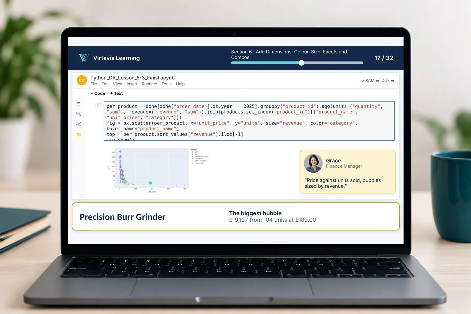
Laptop showing a Python for Data Analytics live lesson: a pandas and Plotly bubble chart in a notebook, with a request from Grace in Finance
You will need

A free Google account and a modern web browser. Everything runs in Google Colab, so there is nothing to install on Windows, Mac or Chromebook. No Python experience is needed: Section 1 is a brisk refresher of the essentials.

What's included

Everything in this course

Video lessons

Turn each question into a plain-English pandas sentence, try the code yourself, then watch it built live and compare.

Course handbook

A handbook for every section, so you can review the ideas and examples at your own pace.

Quizzes

Short checks at the end of each section to confirm you have understood the key ideas.

Challenges and solution walkthroughs

A challenge brief to work through on your own in each section, then a solution walkthrough to compare your work with.

The Kettle & Bean data

Three years of sales, customer and returns data from the fictional company, with a starter notebook for each lesson.

Check cells

Built-in checks in every notebook tell you whether your answer is right without giving it away.

Two pages of the Python for Data Analytics handbook: the Section 2 pandas cover and the Lesson 2.2 page on select and filter

Inside the handbook

A handbook for every section

Each section has its own handbook with the notes, analogies, every worked example with its real result, and space for your answers. Type in the fillable PDF or print it.

Shown: the Section 2 cover and the Lesson 2.2 page on select and filter.

Course content

Eight sections, one final project

  1. 1Section 1

    Python for Analysts: Colab and the Essentials

    Open Colab, meet your notebook and refresh the Python essentials, then load your first data with pandas.

  2. 2Section 2

    pandas: Explore, Filter and Summarise

    Select, filter, sort, calculate, count, group and summarise with DataFrames.

  3. 3Section 3

    Get Data from Anywhere

    Read CSV, Excel and JSON files, query a database with SQL, call an API and scrape a page legally.

  4. 4Section 4

    Clean, Combine and Check

    Handle missing values, types, text and duplicates, merge tables and check your data.

  5. 5Section 5

    Dates and Time Series

    Resample, measure growth against last month and last year, and add rolling averages.

  6. 6Section 6

    Visualise with Plotly

    Choose the chart from the question, build Plotly charts and apply a house style.

  7. 7Section 7

    Customer Analysis: Cohorts and Segments

    Track new and returning customers, build a cohort retention matrix and RFM segments.

  8. 8Section 8Final project

    AI, Automation and Final Project

    Work with AI in Colab and check it, build a reusable notebook and share your analysis.

Final project: the 2025 Customer Insights Report

In Section 8 you load, clean and check the data, then analyse growth, channels, new and returning customers, cohort retention and RFM segments. You finish with a re-runnable notebook report with charts and three recommendations.
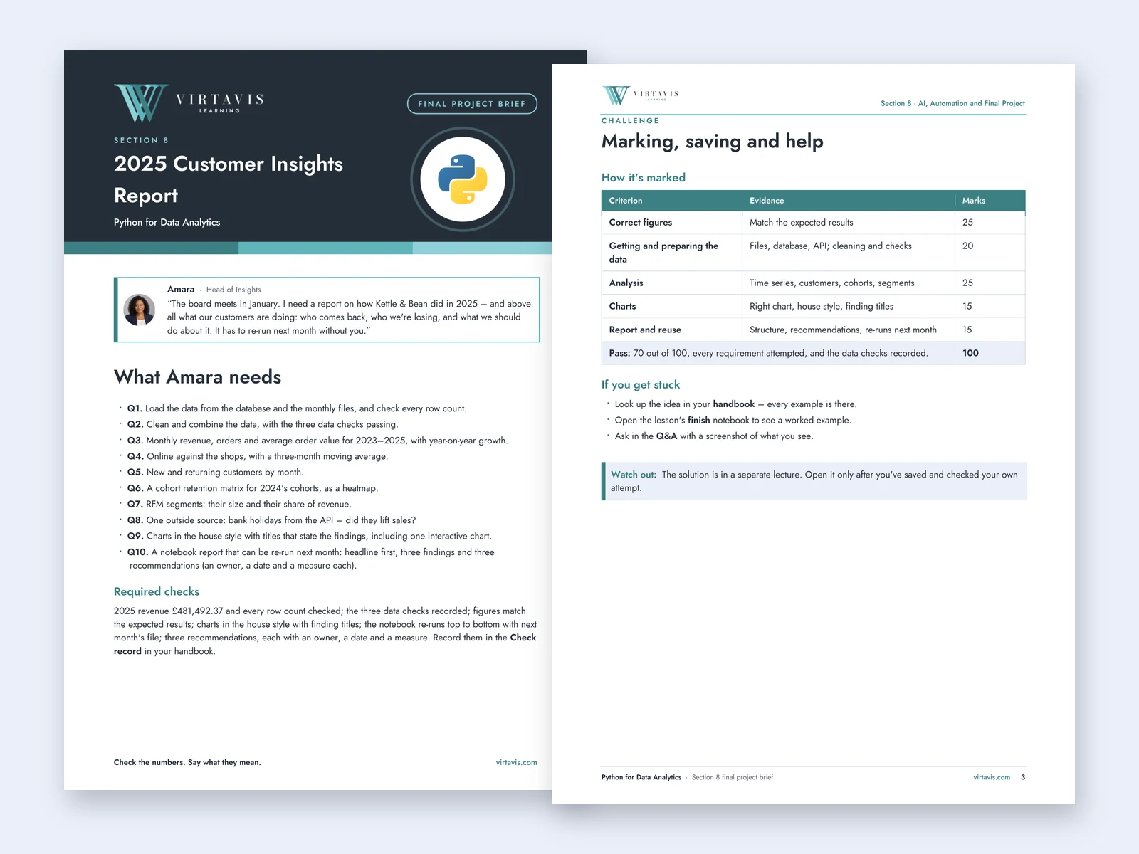
Two pages of the Python for Data Analytics final project brief: Amara's request for a 2025 Customer Insights Report with ten questions, and the marking table

See inside the course

Real notebooks, real results

Explore slides from the actual lessons, including the live demonstrations. Click or tap any image to see it full size.
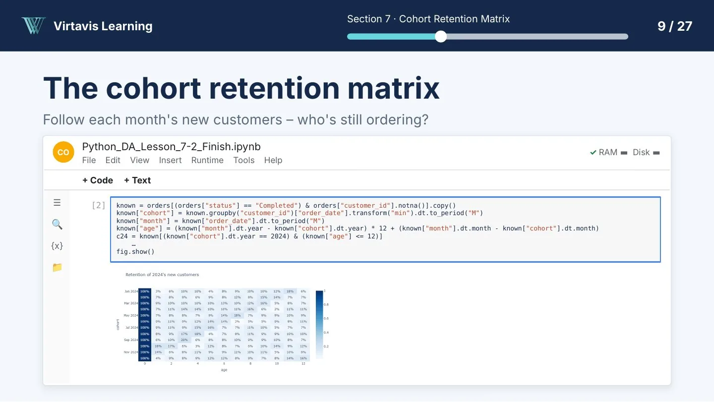
Lesson slide: building a cohort retention matrix heatmap in a Google Colab notebook
Section 7: Build a cohort retention matrix in Google Colab.
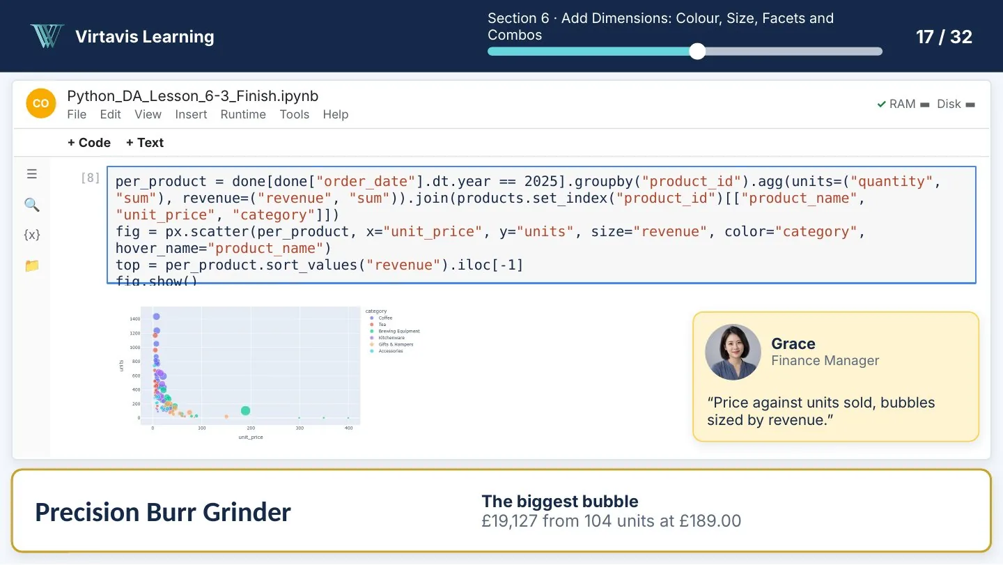
Lesson slide: a Plotly bubble chart of price against units sold, with a request from Grace
Section 6: An interactive Plotly chart of price against units sold.
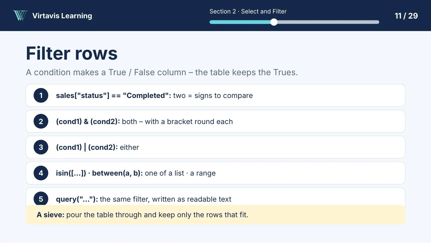
Lesson slide: five ways to filter rows in pandas
Section 2: Filter rows in pandas.

Kettle & Bean Co. is a fictional company created for teaching.
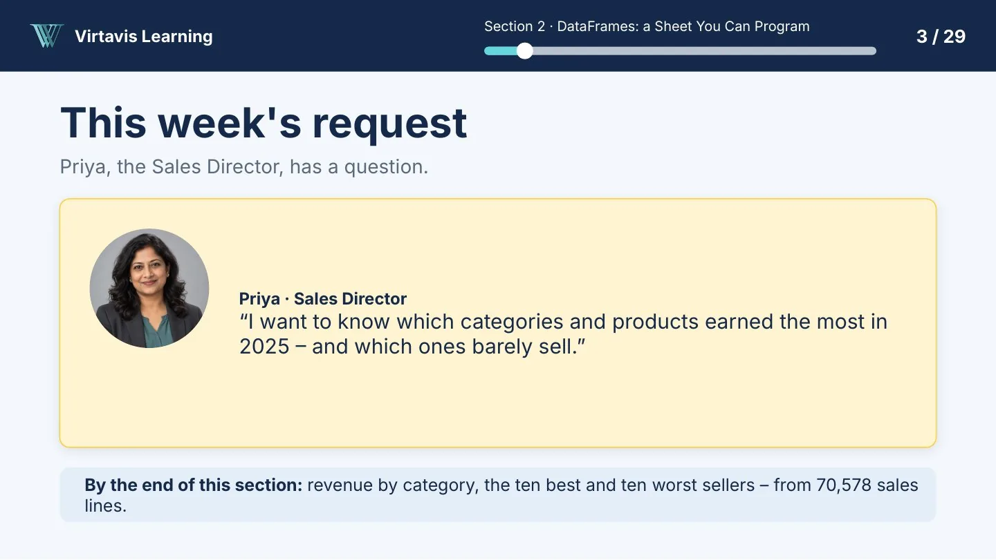
Lesson slide from Section 2: Priya, Sales Director, wants to know which categories and products earned the most in 2025

The learning scenario

Answer questions from the Kettle & Bean team

Each lesson starts with a realistic request from a colleague at a fictional UK coffee and tea retailer. You query the data, check the result and explain what it shows.

  • Amara
    Head of Insights
  • Priya
    Sales
  • Grace
    Finance
  • Marcus
    Operations
  • Tom
    Marketing
  • Ellie
    Customer Service
Watch the free preview ›
Sophie Lumpa

Created by Virtavis Learning

Sophie Lumpa

Data and Business Intelligence Specialist, founder of Virtavis Learning

Sophie Lumpa created this course and designed the Kettle & Bean learning scenario, bringing realistic business questions into the learning experience. The Virtavis teaching team provides additional training and learner support through the Bootcamp and live cohorts.

  • BCS Certified Data Analyst
  • BSc (Hons) Business Management and IT
  • Adult education teaching qualification
  • AgilePM
  • Certified Scrum Master

Questions

Questions about the course?

Something else?

If your question isn't answered here, send it to us and the Virtavis team will reply by email.

Contact us ›
Do I need to install Python?
No. Everything runs in Google Colab in your web browser, with a free Google account. It works on Windows, Mac and Chromebook.
Do I need any Python experience?
No. Section 1 is a brisk refresher of the essentials. If you have never coded, expect to pause and replay in Section 1, or start with Python for Complete Beginners.
Where do I buy this course?
On Udemy. The "View on Udemy" button opens the course page, where you can see the current price and terms.
Is it included in the Bootcamp?
Yes. The Virtavis Bootcamp brings all six courses together with the full practice dataset, additional templates and learning resources, and email support. A tutor-supported option is also available with four 30-minute one-to-one sessions, subject to the published package terms.
Does the course use AI?
One lesson shows how to work with AI in Colab and check every answer before you use it. AI availability in Colab varies by account and region.
Do I get a certificate?
Udemy provides its certificate of completion, subject to its terms. As part of our commitment to delivering high-quality professional learning, we are working towards obtaining CPD accreditation for our courses. We look forward to sharing further updates as we progress.

Start with the free preview.

See how the lessons work before you choose.

View on Udemy ›Explore the Bootcamp